Myno was a newly created Biochar company based in the USA. They worked with the team South Pole to determine their brand positioning Make Carbon History and now needed a new brand to match.
Solution
In my capacity as Creative Lead for South Pole, I lead conversations with the client to determine the brand personality, direction and key audiences. I then developed 3x concepts for the brand direction based on their industry and positioning and this was chosen in the first round.
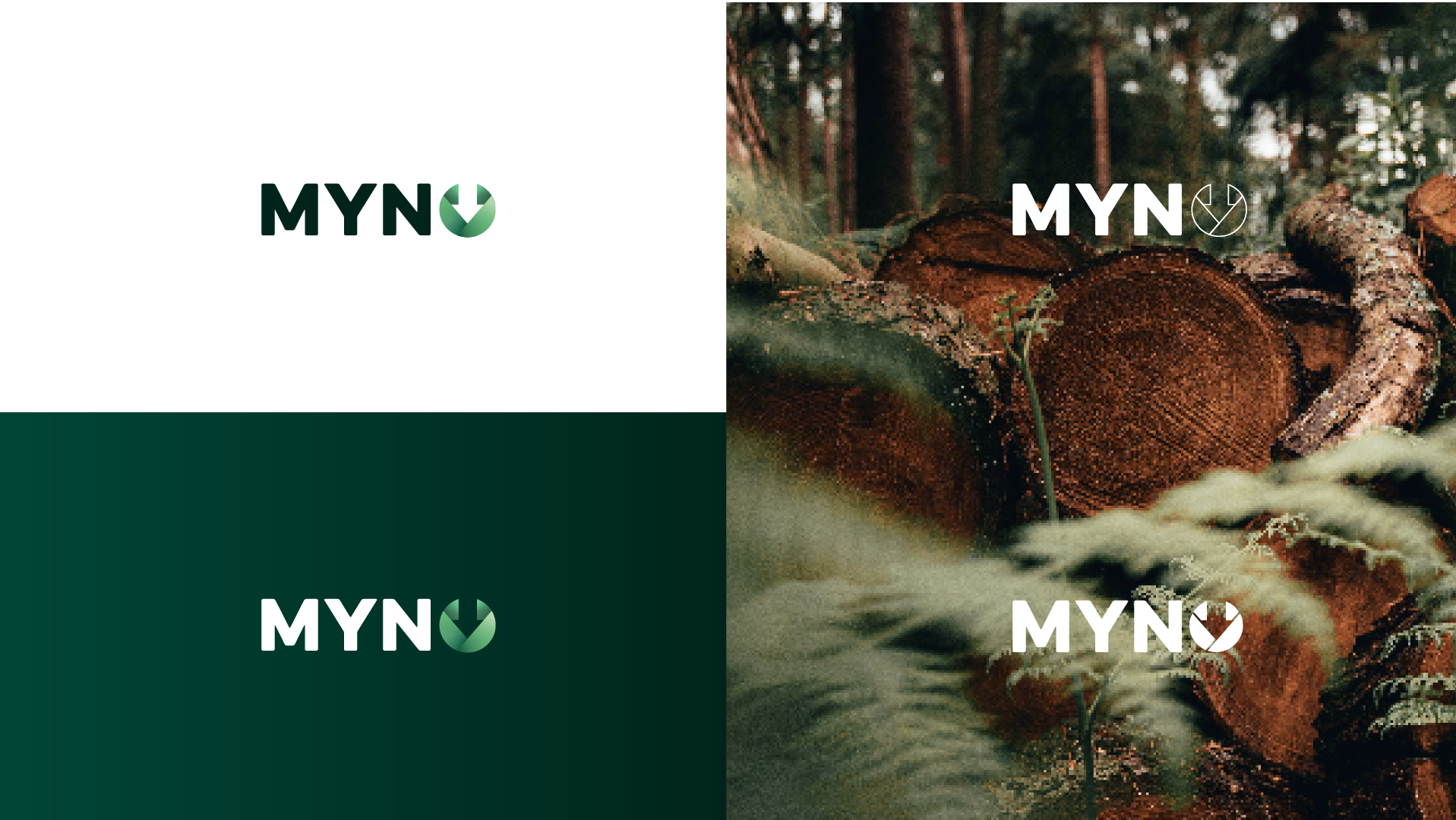
The logo is unique to Myno and their core purpose, formed by overlapping leaf elements to represent the Biochar industry, and forming a downward arrow to represent their mission to capture carbon from the atmosphere into the earth.
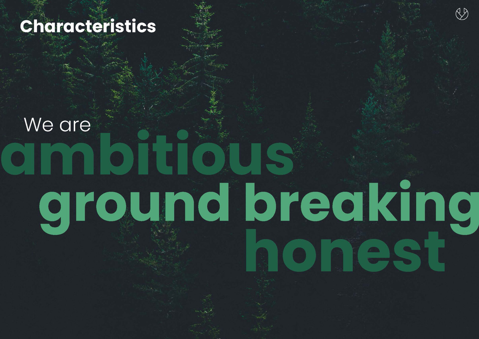
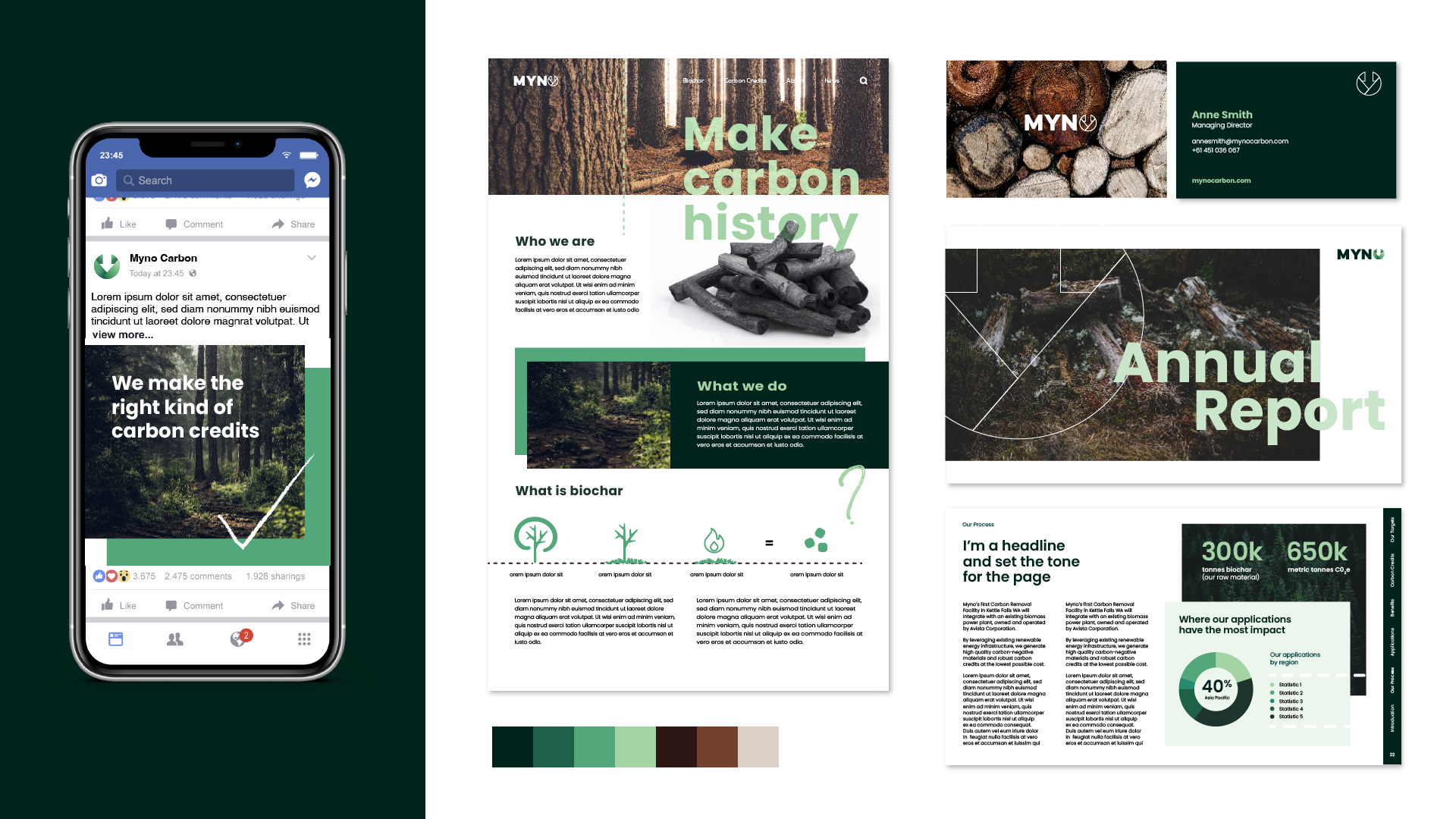
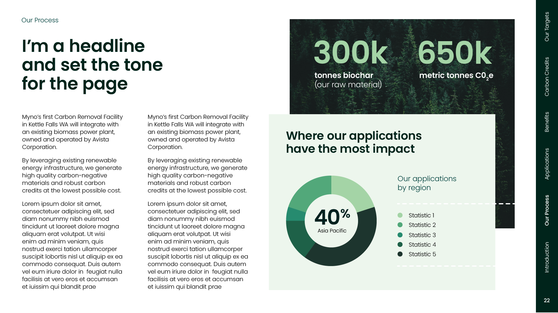
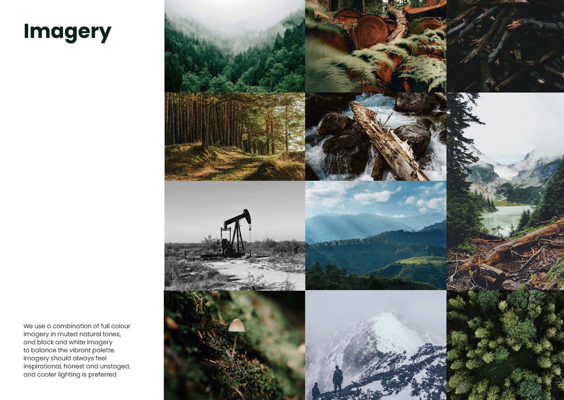
I developed this into an accompanying visual language, using a naturally inspired palette to further the connection with biochar, bold typography and forms to project strength, and hand-drawn illustrations and iconography to create contrast whilst evoking charcoal drawings. I later developed this into brand guidelines, UI designs for the website across desktop and mobile, and a suite of assets including videos, pitch decks, fact sheets, powerpoint templates, etc to provide practical tools to support the brand launch.